
 Circular heat map
Hello. Is it possible to create such plot using OxyPlot ?
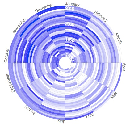
I assume this is some modification of HeatMapSeries. If possible, could you please provide me with some code example?


Scatter plot point color
Hi all
I've have a WinForms application that I developed a while ago that uses Microsoft's Chart control.
Now I would like to move this application to WPF and found oxyplot, which seems to be all I need except for one thing.
I reallize that my usecase is a bit special, but here goes:
In my app, the user starts off with an empty chart (scatter plot). He adds points to an ObservableCollection by clicking anywhere on the chart. Clicking the point again, he can change some state of that point, right clicking removes it again.
Once he is complete, he can start a process that will do some stuff with each of the points, depending on where they are defined. So far so good.
Now to the problem:
In the old application, the state of the point (e.g. processed / unprocessed) is represented by a different image, so it's easily visible on the chart which point is in which state.
And here is my problem with oxyplot. I do not seem to be able to define a seperate point color based on a state. It seems to always take the color of the series.
What I have tried:
In my ViewModel, I've defined a couple CollectionViews, which filter points based on the state. This gives a proper result. But if I add a new Series in oxyplot using the CollectionView as an ItemSource, I only see the points of the last CollectionView that was added.
Code example:
public ICollectionView BasePoints { get; private set; }
public ICollectionView ModelPoints { get; private set; }
BasePoints = CollectionViewSource.GetDefaultView(ModelPointManager.GetInstance().PointList);
ModelPoints = CollectionViewSource.GetDefaultView(ModelPointManager.GetInstance().PointList);
PlotModel.Series.Add(new ScatterSeries(ModelPoints));
PlotModel.Series.Add(new ScatterSeries(BasePoints)); <---- only these points show up
However, if, instead of using collection views, I use "decoupled" collections (like sepereate ObservableCollections), they both show up.
I've also tried to create my own ScatterSeries based on the one from OxyPlot, and then to override the ActualMarkerFillColor property that I found in the source code:
public new OxyColor ActualMarkerFillColor {
get { return OxyColor.Parse("#00000000"); }
}
However, setting a breakpoint there is never getting hit, and of course the color is also not shown in the map.
So, at the moment, the only way to go about this is to create a bunch of collections, assign them to individual series, and when a point changes it's state in the original collection, manage all the others somehow.
This will be quite cumbersome, as there are a bunch of states a point can have, and the result would be that I would need to manage about 7 or 8 different collections, only to have them show up in the proper color.
Before I do this, does anyone have an other ideas / hints / tips on how I could achieve what I am trying to?
Thanks
Martin

ErrorColumnSeries with different upper and lower limits
I would like to plot confidence intervals on my column chat - however I couldn't find a way to set the upper and lower limits separately. Is there a way to do that?
If not, somebody should do it ;) (sorry I just started with oxyplot and have no idea how to do it).
Cheers
Marwin

Save an OxyPlot Chart with XamlWriter
Hello,
I Try to Save a Chart with the XamlWriter.Sav-Metho, but i got an exception that it can not be serilized.
Can someone Help me to Save the complete Chart in an XAML-Code?

How to draw sine and cosine wave with parameters (amp, phase, frequency) at the same time?
Hi everyone)
Try to draw sine and cosine wave with parameters with FunctionSeries method. Unsuccessfully...
How to draw sine and cosine wave with parameters at the same time?

Show only the added datapoints at the x axis
Hello,
I want to create a line chart with three series. Each series have the same data values for the x axis.
My problem is that, the x axis interpolate the values between the data points.
Is there a possibility to change this behaviour.

RectangleAnnotation Text Position
Hello!
is there a way to stick the RectangleAnnotation text on the top of the plotarea?
i mean like with a LineAnnotation the text will allways be visible even when i zoom in or out. the text sticks on the top.
my problem is that i wanna use a RectangleAnnotation but a text is conected with a DataPoint
new OxyPlot.Annotations.RectangleAnnotation { TextPosition = new OxyPlot.DataPoint(start + (end-start)/2, getMinMaxValue()[1] * 0.95), MinimumX = start, MaximumX = end, TextRotation = -90, Text = title, Fill = OxyColor.FromAColor(50, OxyColor.FromRgb(0, 102,153)), Stroke = OxyColor.FromRgb(0, 102, 153), StrokeThickness = 1 });
and when i zoom in the text isn´t visible anymore...
has anyone an idea? would be nice

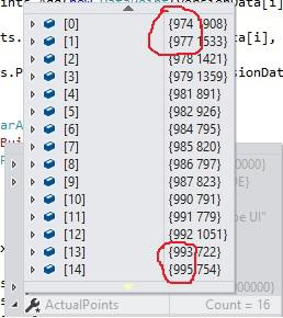
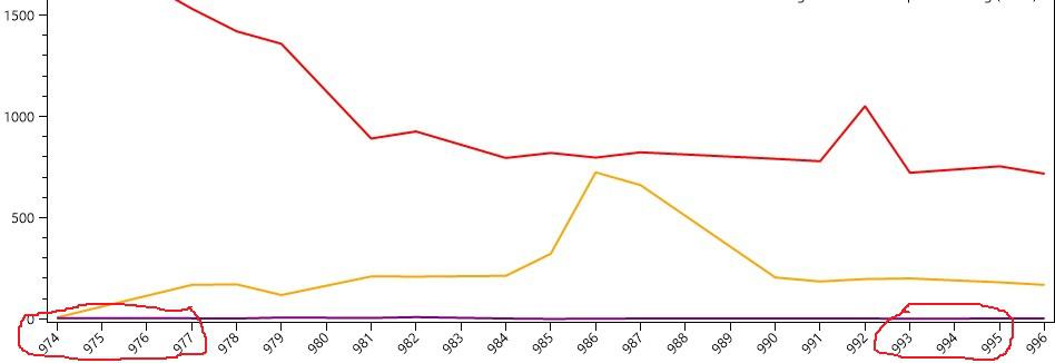
Is there a way to render a Point outside of the Plot? (WPF)
I've created a custom legend and this is more or less the final piece of the puzzle.
Each line is:
[checkbox for series visibility] [*Need to add point shape here*] [Series title] [A custom control that displays data about the data] [row of of Buttons]
Each line creates a series and passes it to the plot, so I already have all the Marker parameters.
I've spent a day going through the example browser trying to dig down to how the points are actually rendered, but I could use some direction. Or, am I going to have to recreate the shapes in XAML?

How to create plot with two line series and fill area between them
Hi,
is it possible to render this type of plot? (the top one)
We have prediction for some value and its observed value and we would like to visualize the difference between prediction and observed value. I tried to use TwoColorAreaSeries but without success.
Thanks
Customer support service by UserEcho